Problem statement
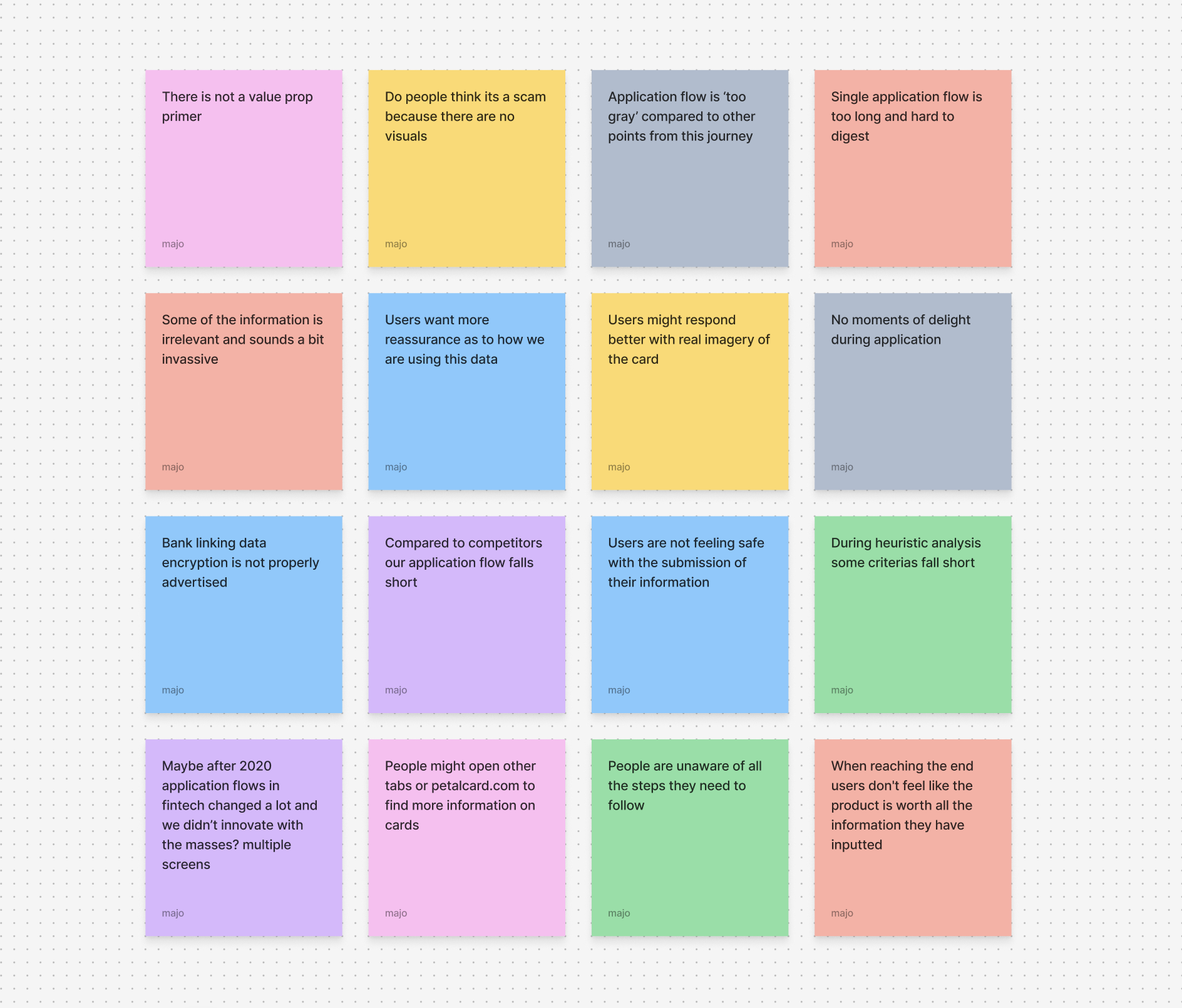
Only 57% submission rate for prequal app on our single application flow
We don’t know the exact “why’s'“ we expect the bank linking drop but during application finished and submitted there is a 27.9% application drop off.
Multi hypothesis
We will brainstorm with stakeholders to align on test priorities and develop hypotheses of varying complexity for incremental engineering testing
We will also use some of the most prominent data that is available to us. This approach will enable us to validate what we know about our users and what we know from previous testings done in-house.
Hypothesis 1
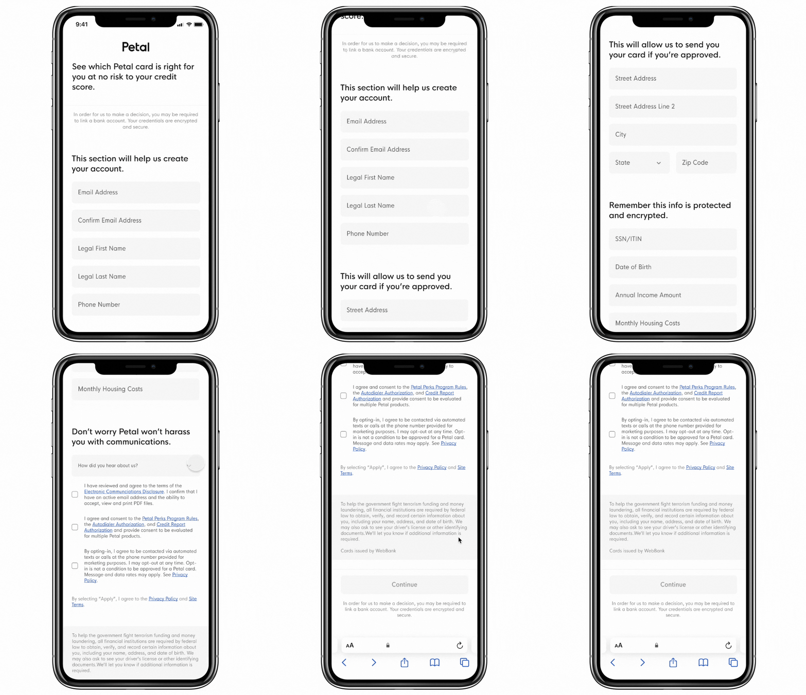
Users need a lot of reassurance when allowing a credit pull, better language will give them confidence to submit
Backed data: From two A/B tests done in 2020 and 2021 for bank linking specifically users responded better to some keywords like ‘data-encrypted’, ‘safe’, ‘you control’, etc.
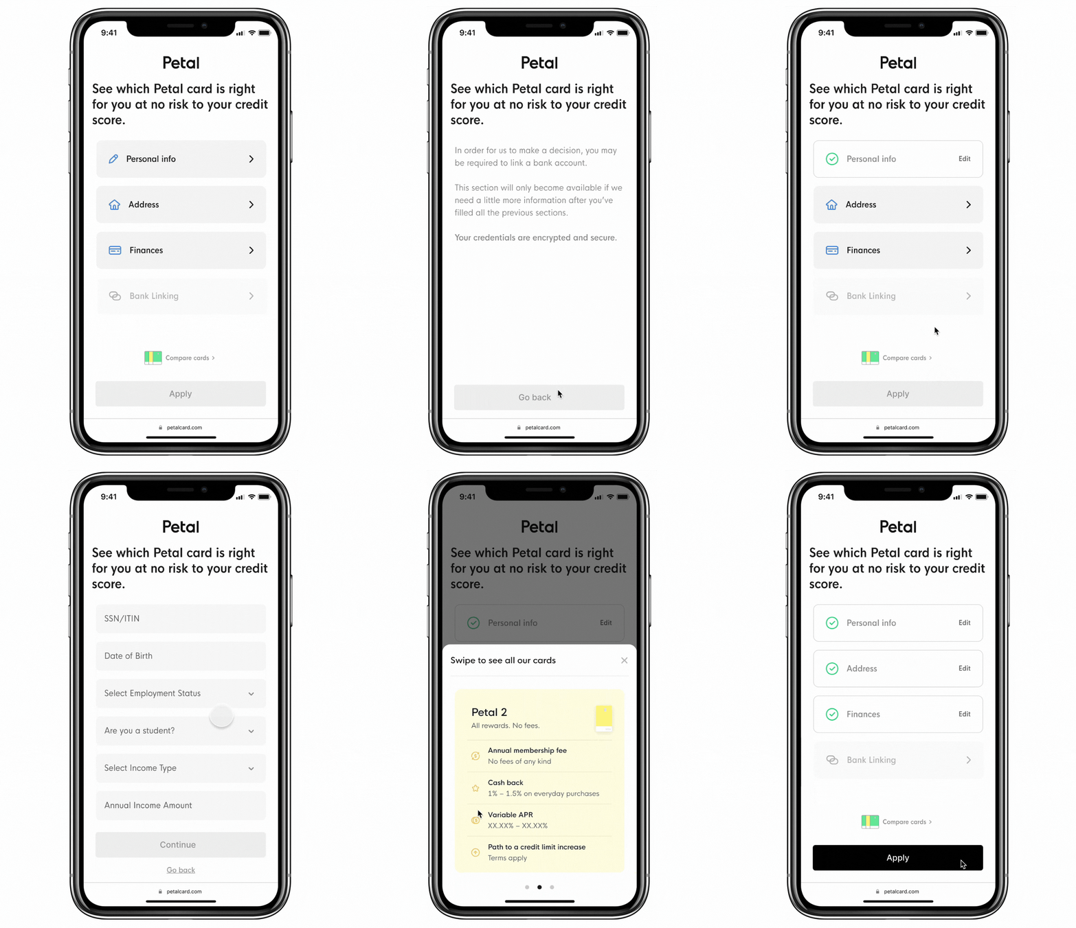
We aim to maintain a single application flow, starting with a low level of effort. By introducing more reassuring language and organizing the flow into clear sections, we can effectively communicate to users the purpose of the information being gathered. Additionally, we positioned the bank linking information both at the top and bottom of the application to reinforce security. This strategic placement assures users that their data is encrypted by our back-end system, providing a sense of trust and security throughout the submission process.
Hypothesis 2
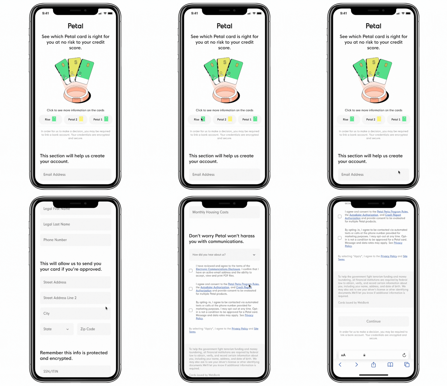
Card terms are not top of mind, they are more likely to submit the app with a primer as it enhances confidence
Backed data: On lifecycle marketing we see 10% better click through rate when presenting users with imagery and value props. We also see users opening a ‘new tab’ during application flow and going back to our affiliate marketing page (lets figure out why)
We selected an illustration consistent with our advertised cards for visual alignment. For the prequalified users from affiliate marketing, we added three dropdowns highlighting primary value propositions, which are now being tested for effectiveness. We optimized screen space to keep parts of the application flow visible as users scroll. The placement of information sections at the bottom will be tested to determine whether the original layout or Hypothesis 1 performs better.
Hypothesis 3
Realistic imagery of card is extremely REASSURING to credit card users as it legitimizes product and company
Backed data: In the fintech industry now 70% of users use realistic or 3D imagery.
Building on the insights from Hypotheses 1 and 2, we aim to integrate realistic imagery to enhance user engagement. Realistic imagery plays a key role in establishing trust and relatability by humanizing fintech products, making users feel more comfortable with sensitive financial data. It also fosters emotional connection by reflecting real-life scenarios that resonate with users. Additionally, this approach simplifies complex financial concepts, increasing accessibility and transparency while encouraging users to take action.
Hypothesis 4
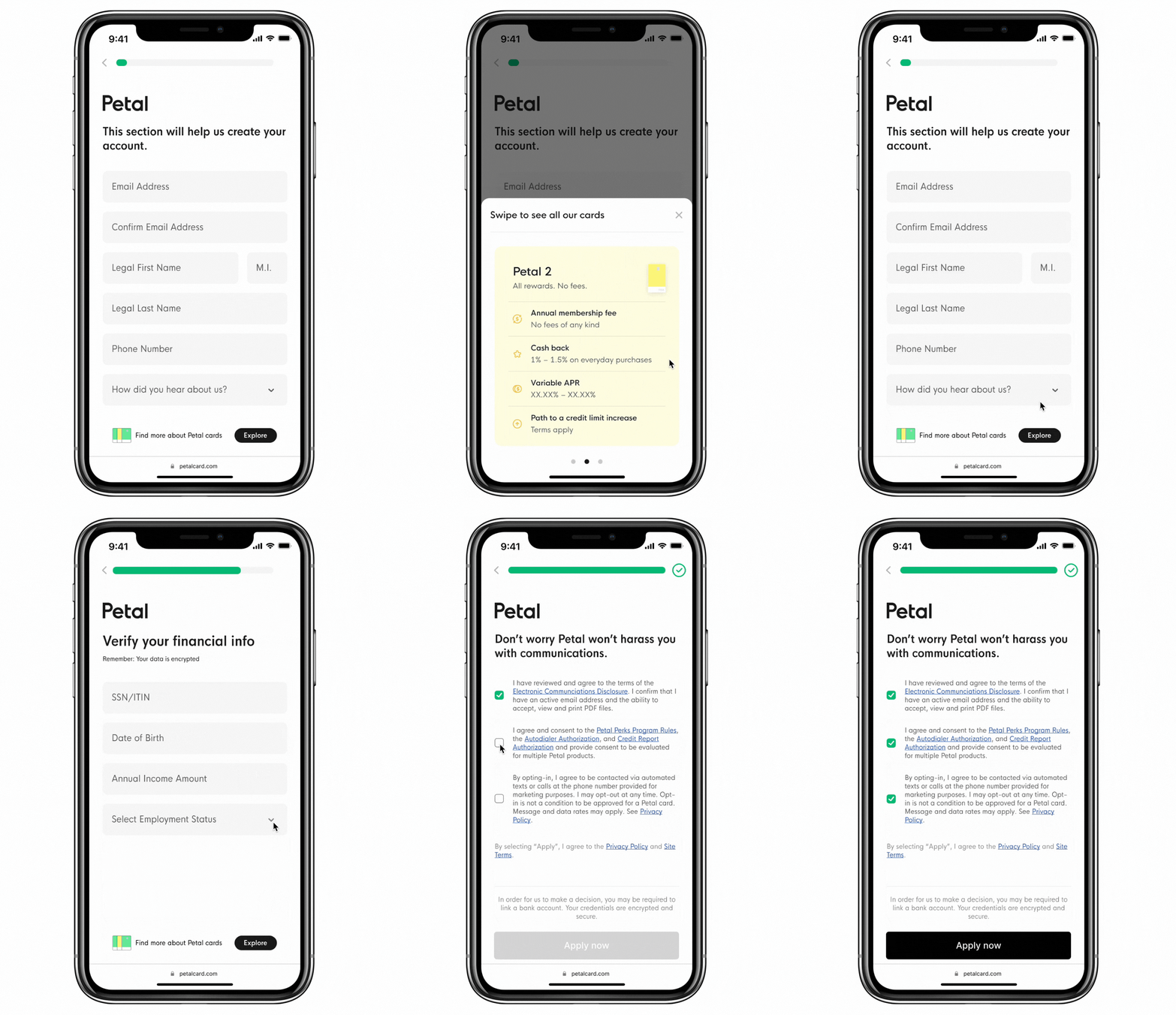
Breaking up the application into chunks gives a user more quick gratification of hitting submit whilst saving time
Backed data: On fintech features that use progress bar we use an average of 15% more engagement (also heuristic analysis backed)
Breaking the application process into manageable chunks significantly enhances the user experience by reducing cognitive load and improving flow. Petal Card users, in particular, respond well to the inclusion of a progress bar, which provides clear visual feedback on their progress and helps keep them engaged. Additionally, the dropdown information bucket at the end of the flow is designed to trigger an auto-scroll into the next section, streamlining the process and making it more agile by cutting down on unnecessary interaction time. At the bottom of the page, we’ve positioned the card’s value propositions, which will only be implemented if Hypotheses 2 and 3 prove more effective than the control design, allowing for further optimization based on user response.
Hypothesis 5
By breaking the process into manageable chunks and presenting all necessary steps upfront, we allow users to mentally prepare for the task ahead
Backed data: About 50% of fintechs break their application flow into multiple screens.
The design I’m presenting is the highest level of effort among the five options, carefully crafted to enhance the user experience. It is organized into three distinct sections, or tables of contents, which clearly outline the information and steps required from the user. This will be the highest level of foreshadowing information input in heuristic analysis. This structured approach minimizes cognitive load, making the process more intuitive and encouraging higher conversion rates. Additionally, it aligns with proven insights that preparing users for the bank-linking process significantly increases conversion percentages, ensuring a smoother and more effective user journey.
outcomes
Overall results, Hypothesis 1 (winner), Hypothesis 2 (winner), Hypothesis 3 (winner), Hypothesis 4 (not winner by only 1% but saved 10 seconds on overall application), Hypothesis 5 (not winer by 5%).
We iterated and adapted throughout the process, uncovering valuable insights along the way. Initially, we assumed users would prefer the multiple-application flow over a single-application approach. However, the opposite was true—users overwhelmingly favored the single-application flow.
Through this discovery, we identified opportunities for optimization. By making each section self-scrollable, we reduced user interaction time by 10 seconds, which significantly improved the experience of linking bank accounts. The ease of use boosted user confidence, leading to a 10% increase in bank-linking submissions. Additionally, introducing reassuring language throughout the flow further enhanced user trust and submission rates.
Another impactful learning came from incorporating a primer with a top image and clear value propositions. This eliminated the need for users to switch between tabs to gather more information about the card, streamlining the decision-making process. While the change didn’t shift quantitative metrics significantly, it provided a noticeably better qualitative experience for users.
Lastly, we reinforced the importance of visual components like progress bars. These elements resonated strongly with our users, offering a sense of accomplishment and instant gratification. As a result, we established progress bars as a key part of our brand’s user-friendly design system moving forward.
This iterative process not only improved the product but also deepened our understanding of user preferences and behavior.

